New Theme WordPress 2017 Twenty Seventeen
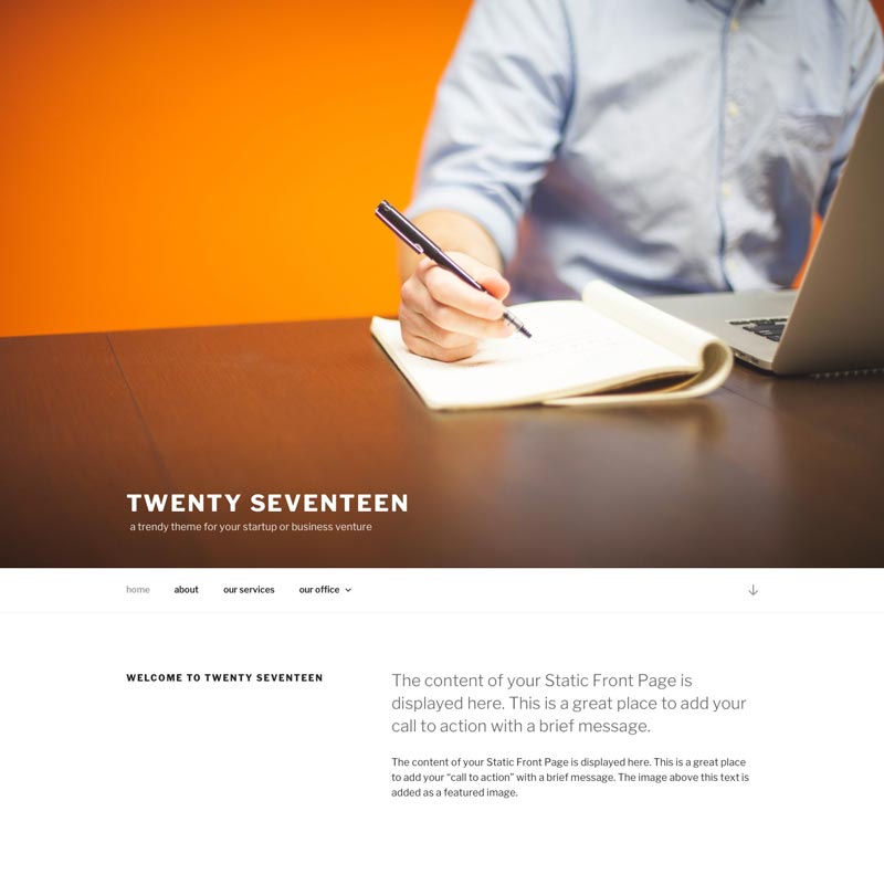
WordPress 2017 – Twenty Seventeen brings your website design to life with header video and immersive featured images. With a focus on business sites, it features multiple sections on the front page as well as widgets, navigation and social menus, a logo, and more. Personalize its asymmetrical grid with a custom color scheme and showcase your multimedia content with post formats. Our default theme for WordPress 2017 works great in many languages, for any abilities, and on any device.

The latest default WordPress 2017 website Theme ready for Twenty Seventeen. WordPress 4.7 will launch with a brand new theme – Twenty Seventeen. Designed by Mel Choyce, Twenty Seventeen sports a modern look and will make a good base for any business website or product showcase.

Accessibility Ready, Custom Colors, Custom Header, Custom Logo, Custom Menu, Editor Style, Featured Images, Flexible Header, Footer Widgets, One Column, Post Formats, Right Sidebar, RTL Language Support, Sticky Post, Theme Options, Threaded Comments, Translation Ready, Two Columns

The use of a landing page to serve as the homepage for business websites has taken the web by force. And Twenty Seventeen makes it easy to build an attractive website business landing page with the default WordPress theme.
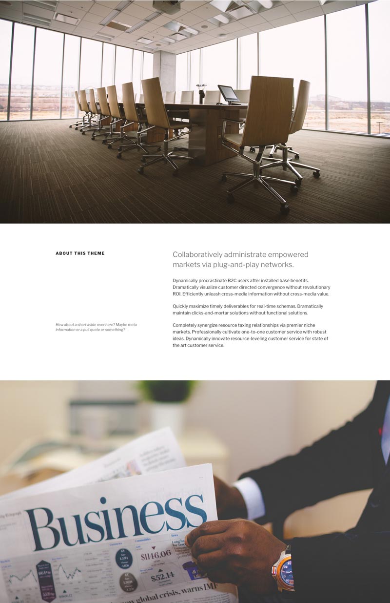
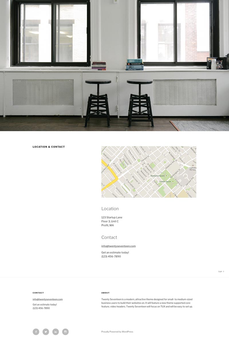
Right off the bat, you’ll notice the video header. Scroll down a little and the sectional design of the page will become apparent. Each section is separated by a striking parallax background image that occupies the full width and height of the viewport.
Navigation is made simple with a sticky top navigation bar. And a single font, Libre Franklin, is used throughout the theme in a variety of weights, brightness values, and styles.
Once properly set up, Twenty Seventeen presents a modern, professional look, built upon readable font selections and strong use of striking visuals balanced by the generous use of white space. Welcome to WordPress 2017.